Blog

Is there an obsession with small consumer technology?

I came across this tiny USB drive by EagleTec. While this is a really neat little device, it is so insanely small that when I saw it I thought that we are becoming obsessed with having the smallest, lightest, thinnest thing out there. My question is.... is this really necessary? Sure, small is good but there is going to come a point where these things CAN'T get any smaller. For example, look at the typical laptop or the one in the picture below, a USB port is roughly 4 or 5 millimeters in height, which means we can't make a system any smaller than that port. The only way to make anything paper thin is to eliminate the ports all together which means we will have to have wireless firewire, USB, and power adaptors. I will make a comfortable assumption that any of the afore mentioned wireless technologies are coming in the near future. Another fact is that all these tiny things are going to get lost sooner or later. Maybe I'm being cynical, but I am perfectly happy with a .5" laptop or .25" iPod. Now if we can make these tiny things hold my entire computer's contents, then that will be something to really be excited about! When it comes to nano-technology, that is really interesting. When it comes to consumer devices, I think we do without all this paper thin stuff.

tiny USB

Adobe Pillows

This is a great gift idea for anyone you may know that is a designer or a photographer. The Adobe pillows offer up many programs that are in the Adobe Creative Suite and are reasonably priced. Even if you want to buy them for yourself, they are a great way of expressing your creativity. Check out more info at http://www.mysuitestuff.com/shop.html.

CS pillows

Portable Espresso Machine

twist1

This is the first truly portable espresso machine, named the "Twist". The design is really neat and it gives the ability to get that jolt of caffeine wherever you are. This is an ingenious idea. Even if you aren't a coffee fan one is still in amazement of such a device. The company who makes it is called mypressi. Check out the site for more info.

twist2

[youtube=http://www.youtube.com/watch?v=IG-Yk0mGKFE&color1=0xb1b1b1&color2=0xcfcfcf&hl=en&feature=player_embedded&fs=1]

User interface design week wrap up!

As the week in user interface design comes to a close, I want to focus on all these technologies as a whole. There is no telling exactly what things will be like in the future, but we can come close. One company that has had a consistent positive vision of how we interact in the future is Microsoft. The company created a video of what things might be like in 2010, and they hit it almost exactly. Therefore I think it is only fitting to show where they think we will be in 2019 in respect to interactive technologies. These are both amazing videos that depict a very functional and useful future that goes back to the basics of what we do as human beings... interaction. In the video depicting 2019, it shows us that we will go back to basic interaction in the most influential, technological and exiting ways. People will be able to communicate on a global level as we never thought possible. Enjoy the videos and heres to the future!

[youtube=http://www.youtube.com/watch?v=RiTb3-t4YJk&hl=en&fs=1]

[youtube=http://www.youtube.com/watch?v=RvtxupQmRSA&hl=en&fs=1]


User Interface Design Part 4 (Minority Report Reality?)

gesture girl

Today, I want to focus on something very large scale. Imagine being in a room with a giant screen and all the people in that room can participate on that screen together. Take this one step further by touching the screen..without  actually touching the screen! That is exactly what the video below shows. For a large group of people this may be the best collaboration tool available. It works by the user wearing some sort of gloves that allow interaction with the screen without actually touching it. This allows the user to manipulate large scale objects with relative ease.

I think this technology could be incorporated into large televisions for a more integrated user experience once they work all the bugs out. As usual some of these ideas seem a little weird or unlikely at first, but thats what people said about the computer and many other devices we now use on a daily basis. You be the judge.

[youtube=http://www.youtube.com/watch?v=dyMVZqJk8s4&hl=en&fs=1]

User Interface Design Part 3 (Napkin PC)

napkin pc 2

For part 3 of this series I want to focus on something very creative and special. Ideas are not to be wasted, and this concept ensures that good ideas can be brought to life.

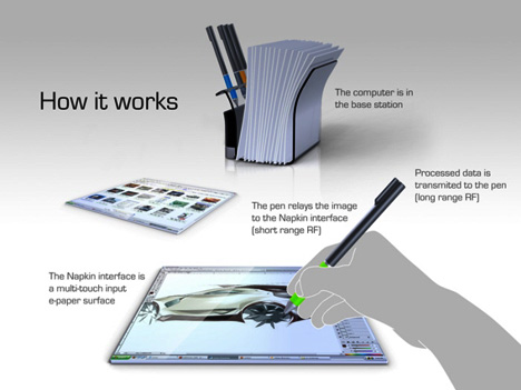
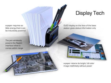
Ok, this may be very far off or may not even happen, but its a really great concept. The napkin PC by Avery Holleman is something that could let your creativity flow in the most natural way. Some of the best ideas are thought up in the most odd places and at the most odd times. This allows you to collaborate with multiple people and save the work for later in a very slim portable design. By encouraging creative workflows, the napkin PC enables creative professionals with the most basic tools for bringing together great ideas. Imagine being able to just be sitting there and take this device out when you have a good idea and just let it flow, making it perfect for people in business, marketing, and design fields.

napkin pc 4

napkin pc 5

The design centers around a napkin holder that  holds multiple napkin PC devices along with the electronic pens that is not unlike some of the pen and tablet devices that are out there right now. The user can grab a napkin and pen from the stack and just go at it! By using RF and OLED technologies, this is something that can definitely be brought to the market. The way the device is powered is by using inductive circuits to power the napkin when the pen is close to the napkin making it power efficient. However if I had to guess, a set of napkins and pens would set you back a few thousand dollars. When the prices of OLED displays come down though this could be much more affordable.


In honor of Earth Day, this product is also very "green"
napkin pc 6

napkin pc 1
napkin pc 7

User Interface Design Part 2 (Aurora Desktop)

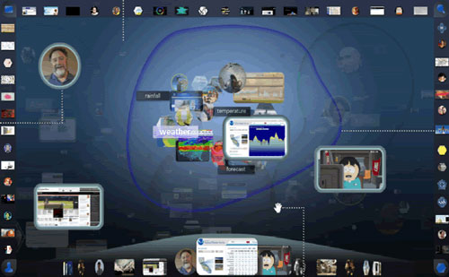
Mozilla has a concept for a new user interface called "Aurora". It takes the Bump Top concept to a whole new level by incorporating an extremely intuitive design for navigating your computer and using smart technologies to find and update data dynamically. The pointing device is also very cool. It is not a mouse, but rather a ball on an arm that you move naturally to navigate. Looks good but I wonder how this device would holdup in the real world. The desktop side bars look a little cluttered and clumsy, but you get the point when watching the video. Those things can always be tweaked.

The video is best watched in full screen high definition which I have linked to below. Enjoy!


Aurora (Part 1) from Adaptive Path on Vimeo.

Aurora image

User Interface Design Week! Part 1 (Bump Top)

This week is going to be dedicated to some of the most amazing concepts for the future of the user interface on a computer. To kick things off, I am going to talk a little about the most logical next step in the computer interface with a product called Bump Top. The user interface on a computer has been largely unchanged in the past three decades. We still click on little icons on the desktop or in a window to get what we want. With BumpTop that is transformed into a 3-D space with real physics when you take action on a particular file. The best way to view and explain this is on the video below from one of the designer's himself. This represents a great evolution in how we may very well be interacting with out computers in the next few years.

Throughout the week, I will be writing on some more futuristic, yet amazing and realistic technologies that will change the way we will interact with computers in our not too distant future. For now, check out this great video on Bump Top!

[youtube=http://www.youtube.com/watch?v=eqcmPJ-oVL0&color1=0xb1b1b1&color2=0xcfcfcf&hl=en&feature=player_embedded&fs=1]

Relaxation at it's best!

Today I'm going to talk about something fun. This is something that I stumbled upon on a site that specializes on cool design techniques on just about anything. The picture below is from Maia, A Luxury Hotel in The Seychelles. This is simply relaxation at its best. The atmosphere looks amazing! One word, Paradise.

Hotel Website
Luxury Hotel


Do you really know how much your text messages cost?

Most of us text right? If you don't then I'm sure that you know someone who does. There is a very disturbing fact when it comes to how much you are being charged for text messaging data. Some of you have what is called a "data plan" on you phone, which allows you to browse the internet on your handheld device. This plan allows you to go through gigabytes of data every month, usually for $20-$30. Lets now put this into perspective of text messaging. A typical text message plan for 200 messages is around $5/month. Now, lets think about this mathematically. A full message is $0.20. This message weighs in at 140 bytes. Yeah thats bytes as in REALLY REALLY small. If you do the math, this is roughly $1,500/megabyte. If this was a song from iTunes (3-4 megabytes) then you would be paying about $5,000 for your favorite tune. Thata a pretty hefty price tag for moving a few bytes of data from phone to phone.

This is completely ridiculous and should not be happening, but it is. Your texts are DATA! and you already pay for a data plan! This makes absolutely no sense whatsoever, yet we all put up with it. The phone companies should be ashamed of themselves for doing this. It is literally robbery when you think about it. You are better off just getting an AIM client for your phone (if available) and use that instead. So, I hope you all think a little differently now that I put things in perspective of how much you are really paying for those pithy little text messages.